Erich Seyhan
Content Specialist
How to Choose Flooring Color: A Design Consultant's Complete Guide
I have been helping homeowners pick flooring colors for seven years now, and I can tell you this: color is the decision people agonize over the most. Not the material. Not the plank width. Not the price. The color. And honestly, they should. Your floor color touches every other design choice in the room — the wall paint, the furniture, the cabinets, the light fixtures. Get it right and everything clicks. Get it wrong and you'll notice it every single day.
I'm Jen Kowalski, a CFI-certified design consultant here at VM Power Flooring. I've worked on over 800 color consultations across Pennsylvania and New Jersey since joining the team. I bring samples directly to people's homes because — and I cannot stress this enough — showroom lighting lies. That gorgeous golden pecan stain that looked perfect under fluorescent lights? It can read completely different in your north-facing living room at 4 PM in January. I've seen it happen hundreds of times, and it's why I do what I do.
This guide covers everything I tell clients during our in-home consultations. Whether you're choosing a stain for a hardwood refinishing projector picking an LVP color for a full install, the principles are the same. Let's get into it.
Why Flooring Color Is the Most Important Design Decision You'll Make
Think about how much visual space your floor occupies. In a typical open concept home — and that describes most of the renovations we do in theLehigh Valley and North Jersey — the floor is the single largest continuous surface in your sightline. It covers more area than your walls, your countertops, or your furniture. When you walk into a room, your eye registers the floor color before it registers almost anything else. It sets the baseline for everything.
I worked with a couple in Bethlehem last year who were renovating their entire first floor. They had already picked cabinets, countertops, wall paint, and light fixtures before calling us about the floor. The problem? Their cabinet choice was a warm honey maple, their countertops were cool gray quartz, and their wall paint was a warm greige. When we laid out samples, the wrong floor color made the whole room feel like it was fighting itself. The right color — a natural white oak with a matte finish — tied everything together and suddenly all those earlier choices made sense.
That story plays out constantly. Flooring color is the anchor. It doesn't have to match everything perfectly, but it has to create a foundation that lets the rest of the room breathe. When I consult with homeowners, I always recommend choosing your floor color early in the design process, not last. You can change a wall color in a weekend. You cannot change your floor color in a weekend.
There's also the resale angle. We have a team of 35+professionals and we've completed over 4,000+ projects since 2003, so we see what sells and what doesn't across both markets. Real estate agents in our area consistently tell us that flooring color is one of the first things buyers comment on. A well-chosen floor color makes listing photos pop and makes the home feel cohesive during walkthroughs. A poorly-chosen floor color — one that feels too trendy, too dark, or too cold — can actually slow a sale.
The good news is that choosing the right color is not as overwhelming as it feels. Once you understand a few core principles — light vs. dark, warm vs. cool, how lighting affects perception, and what hides wear — the options narrow down quickly. That's what this guide is for.
Light vs. Dark Floors: The Honest Pros and Cons
This is the first fork in the road for every client I work with. Light or dark? It sounds simple, but the implications ripple through everything. I'll break it down honestly, because there are real trade-offs either way.
Light Floors
Light-toned floors — think natural oak, light ash, or a pale maple — make rooms feel bigger, brighter, and more open. This is not just a design theory; it is physics. Light colors reflect more ambient light, which makes walls feel farther apart and ceilings feel higher. In the older PA colonials and split-levels we work on constantly, where rooms tend to be smaller and natural light is limited, a light floor can be transformative.
I did a consult for a family in Morristown who had original 1960s red oak stained in a dark walnut. The living room felt like a cave. We refinished it with a natural stain and a matte water-based finish, and the homeowner literally said the room felt like it had grown. The room was exactly the same size — but the perception changed completely.
Light floors also give you more flexibility with furniture and wall colors. You can go dark with your couch and accent pieces without the room feeling heavy. Light floors are forgiving that way. They play well with the warm whites, soft greens, and earth tones that dominate current wall color trends.
The downside? Light floors show certain types of dirt more readily. Darker debris — crumbs, soil tracked in from outside, dark pet hair — stands out on a pale floor. If you have three kids and two dogs, you will be sweeping more often. They also show water stains and spills more easily before you wipe them up.
Dark Floors
Dark stains like jacobean, ebony, and dark walnut create drama. There is no denying the visual impact of a deep, rich dark floor in a well-lit room. It grounds the space and makes white trim, light furniture, and bright accents pop. In a large, open great room with floor-to-ceiling windows, a dark floor can be absolutely stunning.
But here is where I get honest with clients: dark floors are high maintenance. Every speck of dust, every light-colored pet hair, every scratch, every scuff shows on a dark floor. I have lost count of how many homeowners in Bergen Countyhave called us within a year of installing a dark jacobean floor asking about refinishing it lighter because they cannot keep it looking clean. The floor wasn't dirty — it just looked dirty because every particle of dust was visible.
Dark floors also shrink rooms visually. If you are working with a smaller home — a lot of the 1950s capes and ranches in the Lehigh Valley fall into this category — a dark floor can make an already compact room feel cramped. You need strong natural light and light-colored walls to offset the visual weight of a dark floor.
- Best case for light floors: Small rooms, limited natural light, homes with kids and pets, open concept layouts, resale focused
- Best case for dark floors: Large rooms with abundant natural light, high-contrast design schemes, formal spaces, homeowners who clean frequently
- The sweet spot: Medium tones like provincial, special walnut, or golden pecan — they give warmth and character without the extremes of maintenance or visual heaviness
Warm Tones vs. Cool Tones: What's Trending in 2026
Beyond light and dark, the other major axis is warm versus cool. Warm tones have yellow, gold, red, or amber undertones. Cool tones lean toward gray, blue, or silver. And I will tell you right now — in 2026, warm is winning decisively.
The gray floor trend that dominated from about 2016 to 2022 has reversed hard. We saw it coming at VM Power Flooring because our install numbers told the story before any design magazine caught on. Gray stain orders dropped 60 percent between 2022 and 2024 in our business. By 2025, I stopped bringing gray samples to initial consultations unless a client specifically requested them. In 2026, maybe one in twenty clients asks for gray. It is essentially over.
What replaced it is a return to the natural warmth of wood. Homeowners want floors that actually look like wood — warm honey tones, golden ambers, rich medium browns. The colors that were considered "boring" during the gray craze are now the most sought-after choices. Natural white oak with a clear coat. Golden pecan on red oak. Provincial with a matte finish. These are the stains I'm applying to sample boards every single week.
In the LVP world, the same shift is happening. Shaw's Endorsement and Floorte Pro collections have moved heavily toward warm oak and hickory looks. COREtec's most popular colors in our market are the warm naturals — the Sparrow and the Rustique Oak are consistently the top sellers at our suppliers. Mohawk's RevWood Premier line is trending the same way. The cool gray LVPs that filled warehouses two years ago are now sitting on clearance racks.
Now, I want to be careful about absolutes. Cool tones are not "wrong." There are homes where a cooler palette works — a sleek, modern condo with a lot of glass and steel, for instance. And if you love the look of a cool-toned floor, you should get it. You live there; I don't. But if you are asking me what will look current for the longest and appeal to the widest range of people, it is warm tones. That is not going to change soon. Warm tones have been the historical default for centuries, and the gray detour was an anomaly, not a new direction.
How to Tell If a Sample Is Warm or Cool
This trips people up more than you might think. Here is my simple test: hold the sample next to a piece of plain white printer paper. If the floor looks yellowish, golden, or reddish by comparison, it is warm. If it looks grayish, bluish, or silvery, it is cool. Some floors are relatively neutral — natural white oak with a water-based finish, for example, reads as a soft warm-neutral that works in almost any setting. That is one reason it is so universally popular right now.
Pay attention to the undertones in your stain choice too. Duraseal Provincial, for example, has warm amber undertones. Special walnut is warmer than it looks on the can — it pulls brown rather than gray on most white oak floors. Jacobean reads warm-dark on white oak but can skew cooler on red oak because the red undertones of the wood interact differently with the stain. These are the kinds of details that a sample on your actual floor, in your actual lighting, reveals instantly.
How to Match Flooring to Your Cabinets and Walls
This is the question I get asked more than any other during in-home consultations: "Should my floors match my cabinets?" The short answer is no. The longer answer involves understanding contrast, undertones, and visual hierarchy.
The Matchy-Matchy Trap
When your floor color exactly matches your cabinet color, the room looks flat. There is no depth, no visual interest. I see this a lot in homes where the previous owner installed honey oak cabinets and honey oak floors — everything blends into one wall of sameness. It was common in the 1990s and early 2000s, and it is one of the first things homeowners want to fix when they renovate.
Instead, think about complementary contrast. You want the floor and cabinets to be in the same tonal family — both warm or both cool — but at different points on the shade spectrum. Light cabinets with medium-toned floors. Dark cabinets with lighter floors. Medium cabinets with either lighter or darker floors. The contrast creates dimension and makes each element stand out.
Common Cabinet and Floor Pairings That Work
- White or off-white cabinets: These are the easiest to work with. Almost any floor color pairs well — natural oak, golden pecan, provincial, even darker stains like special walnut. White cabinets with a natural oak floor is the most requested combination in our PA and NJ market right now by a wide margin.
- Dark navy or charcoal cabinets: These bold cabinet colors need a lighter floor to avoid making the kitchen feel heavy. A natural white oak or light ash floor creates the contrast these cabinets need to breathe. Avoid pairing dark cabinets with dark floors unless the kitchen is exceptionally large and well-lit.
- Medium wood-tone cabinets (walnut, cherry, maple): Go lighter on the floor to create separation. A natural or slightly golden-toned hardwood floor lets the cabinet wood be the star. Matching a walnut cabinet with a walnut-stained floor creates that flat, one-note look I mentioned earlier.
- Light gray or greige cabinets:Pair with warm-toned floors. The warmth of the floor balances the coolness of the cabinets. A golden pecan or honey-toned floor with light gray cabinets is a combination I've recommended many times in newer builds across Easton and Bethlehem, and it photographs beautifully.
Walls and Floors
Wall colors change far more often than floors, so I tell clients to choose the floor first and adapt walls later. That said, here are the principles: warm floors pair best with warm-toned walls (creamy whites, warm grays, sage greens, tans). Cool-toned floors pair with cooler walls (true grays, blue-greens, cool whites). If you mix warm floors with very cool walls or vice versa, the room feels disjointed — like two different design plans collided.
One thing I see a lot in the PA colonials we work on: dark wood trim around windows and doors. If you have stained dark trim and you are choosing a floor color, you either need to coordinate with that trim color or plan to paint the trim. A provincial or special walnut floor can work beautifully with dark-stained trim in a colonial because it creates a cohesive warm wood palette. But a very light, natural floor with dark trim can look disconnected. Consider the whole picture.
The Lighting Factor: Why Samples Look Different at Home
This is the single biggest source of disappointment in flooring color selection, and it is entirely preventable. A sample that looks perfect in a showroom can look completely different in your home. It happens because lighting changes how we perceive color, and showroom lighting is nothing like residential lighting.
Most flooring showrooms — including ours — use bright, consistent overhead LED or fluorescent lighting. This light is relatively neutral and even. Your home has a mix of light sources: natural daylight that changes throughout the day, warm-toned incandescent or LED bulbs, potentially different color temperatures in different rooms, and varying amounts of shade from trees, neighboring buildings, and window orientation.
Here is what happens in practice. A natural white oak sample looks bright and clean in the showroom. You take it home and put it in your north-facing living room in a 1970s colonial in Allentown, where the only natural light comes through two small windows partially blocked by mature trees. Suddenly that same sample looks darker and slightly yellow. The warm-toned recessed lights in the ceiling shift it further. It is still the same piece of wood — but the light it is reflecting has changed, and with it, the perceived color.
This is exactly why I insist on bringing samples to homes. I bring a minimum of six to eight samples for every consultation and we look at them in every room that will get the flooring. We look at them in morning light and afternoon light if possible. We put them next to the cabinets, next to the walls, next to the furniture. Only then can you make a decision that you will be happy with long-term.
Lighting Rules of Thumb
- North-facing rooms get cool, indirect light. Floors will look slightly cooler and darker than they do in the showroom. Warmer stain choices compensate — golden pecan or a warm natural will still read warm in north light.
- South-facing rooms get warm, direct light for much of the day. Floors read warmer and more golden. A stain that looks neutral in the showroom may read noticeably warm in a south-facing room. If you want to keep things neutral, lean slightly cooler in your stain selection.
- East-facing rooms are bright and warm in the morning, cooler in the afternoon. Your floor will look like two different colors depending on the time of day. Medium tones handle this shift better than extremes.
- West-facing rooms are the opposite — cooler in the morning, then flooded with warm golden light in the afternoon and evening. This is actually where golden and honey tones look most spectacular, because the late sun amplifies the warmth.
Artificial lighting matters too. Warm-toned bulbs (2700K, which is what most homes use) push every floor color warmer. Cool-toned bulbs (4000K+) push things cooler and can make warm stains look washed out. If you are renovating and plan to change your lighting, pick the light fixtures and bulb color temperature before finalizing your floor color. Or at least know what you are planning so I can factor that into my recommendations.
"I tell every client the same thing: never pick a floor color under showroom lights. Your home has its own light personality, and you need to see the sample in that context. I've saved hundreds of people from expensive mistakes just by showing up with samples and holding them against their walls at 3 PM on a Tuesday."
For luxury vinyl plank selections, the same principles apply. LVP has a printed design layer, and some printed patterns interact with light differently than real wood. A COREtec plank that looks like a perfect warm oak in the store can develop a slight sheen or color shift under certain lighting angles at home. Always take a sample home for at least 24 hours and look at it in different lighting conditions before ordering.
Colors That Hide Dirt, Scratches, and Pet Hair
Let's get practical. You can pick the most beautiful floor color in the world, but if it shows every speck of dust and every scratch, you are going to be miserable. This is especially relevant in Pennsylvania and New Jersey where we deal with mud season, rock salt tracked in from driveways, kids coming in from playing outside, and all the debris that comes with four real seasons.
I have worked with enough families — especially families with pets — to know exactly which colors hold up to real life and which ones become a constant source of frustration. Here is my honest breakdown.
For Hiding Dirt and Dust
Medium tones win. A natural oak or provincial stain hides everyday dirt and dust far better than very light or very dark floors. Light floors show dark debris (tracked-in soil, crumbs, dark pet hair). Dark floors show light debris (dust, light pet hair, dried water spots). Medium tones split the difference and forgive both. If I could only recommend one stain color for a busy household, it would be Duraseal Provincial on white oak — it is that versatile and that forgiving.
For Hiding Scratches
Matte and satin finishes hide scratches dramatically better than semi-gloss or high-gloss finishes. A scratch on a glossy dark floor might as well be a neon sign — it catches light and creates a visible white line. The same scratch on a matte medium-toned floor is nearly invisible. Wire-brushed and hand-scraped textures add another layer of scratch concealment because the existing texture camouflages minor wear.
Species matters too. White oak (Janka hardness of 1,360) resists scratches better than red oak (1,290), and significantly better than softer species like pine or fir. If you have large dogs, I always recommend white oak over red oak. The difference in hardness is enough to matter in real-world use with pet nails.
For Hiding Pet Hair
This is the question I get from at least half of my clients. If you have a light-colored dog (golden retriever, lab, husky), a light floor will hide the hair better. If you have a dark-haired dog (black lab, dark german shepherd), a darker floor helps. But most households either have multiple pets of different colors or a pet that sheds both light undercoat and darker guard hairs. In that case, medium tones are the answer again.
My specific recommendations for pet households: golden pecan, natural oak, or special walnut on hardwood. For LVP, Shaw's Floorte Pro in a medium hickory or Mohawk's RevWood in a warm maple tone. These mid-range colors disguise most pet hair effectively between cleanings. Pair that with a wire-brushed or textured surface and you have a floor that looks clean even when it technically isn't. For more pet-specific guidance, check out our best flooring for pets guide.
The Best All-Around Colors for Busy Homes
- Hardwood: Natural oak, provincial, golden pecan, or special walnut in a matte or satin finish with a wire-brushed texture
- LVP: Medium oak or hickory tones from COREtec (Sparrow, Rustique Oak), Shaw Floorte Pro (warm maple or hickory options), or Mohawk RevWood Premier (warm oak colorways)
- Avoid for busy homes: Very dark stains (jacobean, ebony, true black), very light whitewashed looks, and anything with a high-gloss finish
Our Top 5 Flooring Colors for 2026 (And Why)
Based on our project data, supplier conversations, and what I'm seeing in homes across Pennsylvania and New Jersey every week, here are the five flooring colors that are defining 2026. These are not aspirational Pinterest picks — these are the colors real homeowners are actually choosing and living with.
1. Natural White Oak (Clear Coat, No Stain)
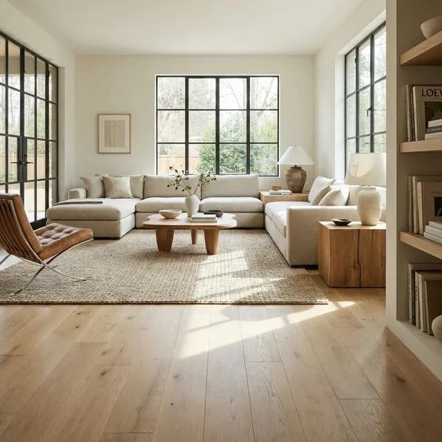
This is the undisputed champion. White oak finished with a clear water-based polyurethane or a natural oil finish, no stain at all. It is the most requested option in our business by a significant margin. The appeal is obvious: it looks like real wood because it is real wood with nothing covering up the grain. The color ranges from a soft straw to a light honey, depending on the grade of the boards and the finish type. It is warm without being orange, light without being cold, and it ages into a richer golden tone over the years.
Natural white oak works in virtually every home style we encounter — modern open plans in new construction, classic PA colonials, mid-century ranches, Victorian-era homes in North Jersey. It is that versatile. This is the floor color I recommend to anyone who asks "what is safe?" It will not feel dated in five, ten, or twenty years because it is not a trend. It is just wood looking like wood.
2. Provincial (Duraseal)
Provincial is my go-to recommendation for clients who want warmth and richness without going dark. It is a medium amber-brown with golden undertones that reads as a classic, timeless floor color. On white oak, provincial brings out the grain beautifully and creates a warm glow that feels intentional without being heavy. On red oak, it tempers the pink undertones that some people find dated and shifts the wood into a more neutral warm-brown range.
Provincial is particularly popular in the PA colonials and traditional homes we work on. It complements the dark-stained window trim and crown molding that characterizes a lot of the housing stock in our area. It also hides everyday wear better than either very light or very dark options, which makes it a practical choice for families.
3. Special Walnut (Duraseal)
If provincial is the warm medium, special walnut is its slightly deeper, more sophisticated cousin. It reads as a medium brown with warm undertones — darker than provincial but nowhere near the darkness of jacobean or ebony. I describe it to clients as the color of a well-aged wood table. It has character and depth without the maintenance headaches of a truly dark floor.
Special walnut has been gaining momentum in both our PA and NJ markets. Designers in Morristown are specifying it frequently for clients who want a floor that feels grounded and substantial. It pairs exceptionally well with white cabinets, light gray walls, and the brass or gold hardware finishes that are popular right now. For homeowners considering a hardwood refinishing project, special walnut is one of the stains I always bring to the consultation.
4. Golden Pecan (Duraseal)
Golden pecan is having a moment, and I think it deserves it. It is a warm, honey-gold stain that enhances the natural warmth of oak without going into orange territory. This is the color for people who want their floors to feel sunny and inviting. In a room with good natural light, golden pecan practically glows.
I have been recommending golden pecan more and more for homes in the Lehigh Valley, especially newer construction in Bethlehem and Lower Macungie where the open floor plans benefit from a warm, unified foundation. It is also an excellent choice for homeowners with older homes that have limited natural light — the golden undertones add warmth that the room might otherwise lack. One caveat: golden pecan on red oak can pull slightly orange, so I always do a test patch first. On white oak it is consistently beautiful.
5. Warm Oak LVP (Shaw Floorte Pro / COREtec Plus)
Not everyone is installing hardwood, and the LVP markethas its own color stars. The top-selling LVP colors across all the brands we carry are warm oak looks — specifically, Shaw's Floorte Pro Endorsement series in warm colorways, COREtec Plus in Sparrow and Virtue, and Mohawk RevWood Premier in warm natural oak tones. These products have reached a level of realism where guests genuinely cannot tell they are not real wood from a standing height.
Warm oak LVP is the dominant choice for basements, kitchens, and whole-house installs where waterproof performance matters. The color direction mirrors what is happening in hardwood — warm, natural, and wood-like. The gray and cool-toned LVPs that filled every showroom three years ago are now the least requested options in our inventory. If you are choosing LVP in 2026, lean warm. You will be aligned with where the market is headed, and the floor will look current for years.
Honorable Mentions
A few colors that didn't make the top five but deserve a nod. Duraseal Weathered Oak is a beautiful, slightly cool-leaning neutral for clients who want something in between warm and cool. Bona Nordic Seal creates a gorgeous Scandinavian-inspired bleached look on white oak for modern, minimalist spaces. And COREtec's Ansley Oak offers an incredibly realistic warm-toned LVP that has become a favorite for our open-concept kitchen installs across both PA and NJ.
What you will notice across all of these picks: they are all warm-leaning or neutral. Not a gray in the bunch. That is not an accident — it is a reflection of where the market has moved and where I believe it is staying. The warm wood revival is not a trend. It is a correction back to the way wood has been appreciated for centuries.
Frequently Asked Questions
What is the best flooring color for small rooms?
Light and medium tones almost always make small rooms feel larger. Natural oak, light maple, and pale ash open up a space by reflecting more light. Avoid very dark stains like jacobean or ebony in tight rooms — they absorb light and make walls feel like they are closing in. If you love darker tones, a medium brown like provincial or special walnut can work if the room has good natural light and light-colored walls. Many of the older PA and NJ homes we work in have smaller rooms, and switching from a dark floor to a lighter one consistently makes the biggest visual difference of any single change.
Are dark or light floors better for resale value?
Light to medium-toned floors consistently perform better for resale in both the PA and NJ markets. Natural oak and warm honey tones appeal to the widest range of buyers. Very dark floors like jacobean or espresso can polarize — some buyers love them, others see them as dated or high-maintenance. If resale is a priority, stick with a natural or provincial stain on hardwood, or a warm oak-look LVP. These are safe choices that photograph well in listings and look clean at showings.
Should my floors match my cabinets?
Floors and cabinets should complement each other, not match exactly. An exact match often looks flat and one-dimensional. The best approach is to stay in the same tone family — warm with warm, cool with cool — but vary the shade. For example, if you have medium-brown maple cabinets, a lighter natural oak floor creates contrast without clashing. White or light gray cabinets pair well with almost any floor color, which is one reason they remain so popular. During in-home consultations, I always hold floor samples directly against the cabinet doors so clients can see the interaction in real time.
What flooring color is best for hiding dog hair?
Medium-toned floors with visible grain or texture hide pet hair far better than very light or very dark floors. A natural oak or golden pecan hardwood, or a mid-tone LVP like Shaw Floorte Pro in a warm maple, hides both light and dark pet hair effectively. Dark floors show light-colored hair instantly, and light floors show dark hair. The sweet spot is that warm middle ground. Wire-brushed or hand-scraped textures also help because the grooves disguise stray hairs between cleanings. Read our flooring for pets guide for more detail.
Do gray floors look dated now?
Gray floors are losing popularity quickly. The gray-washed trend peaked between 2016 and 2022 and has been declining since. Most designers and homeowners in our PA and NJ markets are moving toward warm, natural tones. If you already have gray floors, they still function fine and will not hurt your home value significantly. But if you are choosing new flooring or refinishing existing hardwood, warm naturals and light oaks are the stronger long-term choice heading into 2026 and beyond.
Can you change the color of existing hardwood floors?
Yes — refinishing and restaining hardwood floors is one of the most cost-effective ways to transform a room. The existing stain is sanded off completely, and a new stain color is applied before sealing. You can go from dark to light, light to dark, or anywhere in between. The main limitation is the wood species — red oak accepts stain differently than white oak, and some species have undertones that affect the final color. A test patch on your actual floor is the only reliable way to predict the result. Our refinishing team does test patches as part of every project. Reach out for a free estimate.
Explore Our Related Services
About the Author
Content Specialist
Erich covers flooring topics from the homeowner's perspective — researching materials, interviewing our installers, and translating technical knowledge into practical guides. He works closely with the...
You Might Also Like
Top Flooring Trends for 2026: What Homeowners Are Choosing
Pinterest boards are one thing. What homeowners actually pick when they're spending real money is another. Here's what w...
Read: Top Flooring Trends for 2026: What Homeo… DesignOpen Concept Flooring Ideas: How to Choose One Floor for Your Whole Main Level
Open floor plans need one flooring choice that works everywhere — kitchen, living room, dining room, and hallways. Here'...
Read: Open Concept Flooring Ideas: How to Choo… Buying GuideBest Flooring for Dogs and Cats: An Installer's Honest Guide
After installing floors in hundreds of homes with pets, we know exactly which materials survive claws, accidents, and zo...
Read: Best Flooring for Dogs and Cats: An Inst…